Tuesday, December 29, 2015

Steampunk Wonders Of The Worlds - Watercolors and Music

Have been working on a series of watercolor paintings that all involve strange locations and a Steampunk Airship with the theme of a tour of wonders of the worlds.  And by watercolor paintings I really mean black ink sketches colored with watercolors.


The music and surround sound effects for videos using the paintings has been an ongoing task for some time too.

We put up low and high resolution videos on YouTube today of what we have been working on.   The first new video for over a year now.

The HD version being here:


Even though the video is up, we are still considering the format, and how it should look.  We didn't just want a slide show with a soundtrack, so we have images titles, panning and zooming on the images....and a screen that could be from a following camera drone or surveillance video, but haven't made any of that clear.

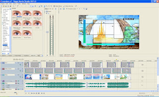
It is put together in Sony Vega Movie Studio HD and rendered as mp4. The music tracks were done in Reaper and some of the strange sounds were done in SuperCollider, and others in the ArpV2600 vst.


The Dolby Surround Encoding just involves having effects sounds assigned to the rear, mono channel, which is encoded with +90 and -90 versions added into the front channels, all just done with the Reaper PhaseAdjust JS plug in.

To do more complex movement a Surround Panner is required, like this one, but we haven't done anything in this video using it.


We have our own simple LM833 based surround decoder device for driving the rear channels in our studio, prototyped on Veroboard and in a previous Blog post.  Have now also tried a HD Audio Rush Sound Decoder  (bought on eBay from HK) , just with the analog in and found our own device sounds better and is quieter.  The HD Rush also comes with a switch mode plug back that generates audible hash, that is not there when powered from a 5V linear supply.  

We have more ideas for the series, to make more episodes, but we will see.....  this type of music video, that isn't focused on cars don't get much attention on our video channel.  It is interesting to see that we have some 3 digit subscribers to our channel, yet only single digit views on a new video...

I guess they aren't interesting enough and don't say very much to a general audience.


Sunday, December 13, 2015

SQ Quadraphonic - A Dead Surround Audio Format.... or is it?


The early 70s introduced the war of Quadraphonic formats that included SQ, QS, CD-4 and others. This was back when Hi-Fi was a thing, and was something a reasonable number of people had, even if only stereo systems.

None of those formats succeeded at that time and quadraphonic died out.  All the systems had problems and the early SQ and QS formats only gave an almost inaudible (3dB) front to rear channel separation in addition to costing twice as much... and the last thing a Classical record needs is to put the audience in the middle of the orchestra.  Rock didn't fair much better.

Later Full Logic decoders appeared.  These improved the channel separation  by using gain elements in the 4 output channels to exaggerate the difference between the channels in a controlled way to improve the channel separation.  Didn't help the market grow though.

SQ Full Logic Block Diagram

I have the 12" Vinyl Deep Purple Machine Head album emblazoned with a SQ logo and QUADRAPHIC, and have never heard it in 4 channels.  Been curious about that.

Now days every Home Cinema has Dolby Surround, and Cinemas are now going to Dolby's ATMOS system with some 60 channels.  But this cinema stuff doesn't really fit music, which doesn't have or want a centre channel, or delayed rear channels.

So could you use a Dolby Surround system with this old SQ Quadraphonic stuff?   That would  require some significant signal processing on the SQ encoded stereo signal first so your Dolby decoder only produced the front left and right and musical rear signals.  Even then, the rear channels were originally restricted to only 100Hz to 7kHz and had a 25ms or so delay added to them. Lots of compromises required, and the result wouldn't be what was mastered on the album.

Most people don't seem to care to sit and listen to music as they once did, unless it is on headphones from an MP3 Player,  so it would seem investigating and even SQ encoding our own musical endeavours in a dead quadraphonic system  is pretty much a waste of time and effort. 

That maybe, but we are considering it as we are pretty much set up to do it anyway with the Reaper DAW and it's JS development language and support for the encoder, and a switchable to  4 speaker and amplifier mixing environment.

The SQ Decoder, and doing that with a few transistors and a SMD based PCB for fabrication by OSH Park is not out of the question. either.  Not a huge Altium Project by any means.  

SQ Decoder Schematic

So not out of the question.   And these things from places like Sony still show up on eBay too.  A Development Kit with fast MCU and Stereo IN, Quad OUT, 16bit+ codecs would be a flexible approach for us C developers too.

So why?   But what about a music with visuals, as in a video?

Dolby Surround (Pro Logic) is a simple system, and what was used on the first Star Wars film in 1977. Their first Surround Decoders where actually designed by the people that did the best SQ decoders. What that system does give you is great separation between the front centre and mono rear surround speakers. Fine if you want Ambience in the rear channels. Not unworkable.

Now the original standard decoder filtered the Surround channel from 10Hz to 7.5kHz. Seems the later "Music" support of Dolby surround now actually has 5 equal full range speakers.
So a quick test of Surround  as L-R, with buffered inputs, and a L+R Center channel, and a level control on the front channels using dual LM833 Opamps looks like this when prototyped quickly. It is powered from a regulated 12VDC source.  The front channels are our standard mix set up, the rear are a DELL satellite + sub woofer we usually use for background music.

Surround = L -R, Centre = L+R matrix decoder
The schematic with a later added bypass switch, to disable the surround mix system is:


In Reaper, our music production DAW, we generated a surround channel by sending the rear tracks, that now aren't routed to mix output to Surround L and Surround R, with Surround L  inverted, and then add these to the mix.  So that tracks that are not dead Center or Rear are a bit of front and rear, and surround tracks are just from the rear. Dead Center just from the front.
The result sounds interesting, and stereo compatible, but not mono compatible. We will try a HD AUDIO RUSH decoder soon, and plan to do our mixes with these rear channels as one mix option.

It is surprising what a Mixed Media Concept Album can inspire in you.  I've spent the last couple of weeks listening to, and reading The Pentateuch of the Cosmogony

Now that isn't in surround, but has given us the drive to expand our own mixed media music art tech project....  An extension of our  SteamPunk Sunset.


.... unless life gets in the way, or something else comes up of course.

So SQ might be dead,  but surround and matrix encoding and decoding that came from it aren't.

And maybe this is a more appropriate logo for what we have done so far......


Sunday, November 22, 2015

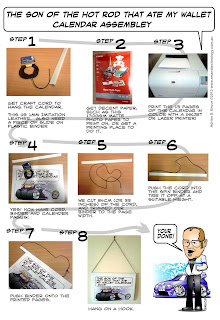
FREE: The Heavy Metal Garage Hot Rod That Ate My Wallet Calendar 2016


Free PDF download from here:
The Heavy Metal Garage Hot Rod That Ate My Wallet Calendar 2016

It is for planning your month, with lots of space to write stuff, like what to pay, or this to be done by....  or at least we use it that way.

But some assembly is required! And this is they way you do it, even if it is for a previous version...


We can be contacted at Art & Technology


Sunday, November 1, 2015

How To Turn Your Car into A Billboard - The Car Wrap

These are every where now, at least where I am. I sit in traffic evaluating these things, and even once saw a company I needed to contact later to fix a stove.

The actual production of the design is just another vector file. You need the car dimensions and even better, a car template. But what is more important to me is what goes on it, and how much anyone can remember of it to be effective.

I can never remember any Phone number on these things. I'd have to take a photo with my phone camera, and that is only possible if you find it in a car park.

I can usually remember the company name and what they do, even if I do not completely remember their slogan.  May be the URL or the form of it.  Having the URL on the rear bumper helps here. But I may get enough to be able to find their website later, especially if the wrap design is reflected in their website design.

So, I don't think most of them work for me. I cannot always work out what they do, and remember enough to contact them if I did.

The lesson is KEEP IT SIMPLE.


Sunday, August 23, 2015

The Making Of Steampunk Sunset, the Painting and Music.


This is the cover art for an instrumental track you can hear for free at our Soundcloud page called  Steampunk Sunset.   It is synth, guitar and drums. But it all started from a water colour painting.

The illustration work we do is mostly technical and very precise.  Lines and colours are very clear, with graduations being very linear, especially with the vector based illustrations.

Our recent joy in water colour is the ability for it to have random effects when you use lots of water on the heavy textured paper, and that is the main ingredient in the water and sky of the sunset painting. With a lot of water on the paper, when the pigment is applied, it kind of moves where it wants to.  This contrasts with the stark black silhouettes of the bizarre steam powered flying machine, land and trees, done in Faber Castell PITT artist pens, which are waterproof ink.


This is a not quite finished view of this A4 painting, done on CANSON 300gsm Medium Cold Press water colour paper with a small Winsor & Newton Sketchers Pocket Box Cotman Water Colour Set. I have replaced the China White with Ivory Black colour, as it is far more useful to me.


So from this painting we thought of what sound and feelings we wanted in the music, and that was to be a steam engine type sound, combined with a Bladerunner esq huge reverb and sparse synth pad.  That was the starting point, but we knew we would put loud guitar in their too.

Our V2600 VST is a semi modular synth with an old style step sequencer, and it already had a sample patch based around a noise source. Just what we were after. So this is the engine sounds that fades in and out for the duration of the track, with the help of a volume envelope in our DAW.


And here is the whole thing in Reaper our DAW. There  are tracks for Drums, Bass synth, Synth lead, Synth pad, Rhythm guitar, Lead guitar and Steam SFX.  All very simple.  


There are also long and short ping pong delays and the HUGE VintageVerb Bladerunner reverb. Just love it and don't have much opportunity to use it, as it is just too big for a usual track.

Everything was first takes in recording, then with some minor editing, put  together, mixed, then mastered. 


It starts with the Synth Pad and Huge Reverb and while not being directly in any way Bladerunner, has that feeling to me as the flying machine comes into the scene from the right.  It is supposed to sound a bit disjointed with the beautiful sunset polluted with this noisy, flapping flying machine, but then when the drums finally come in, it gels together, depicted for the actual moment in the painting.

So this track came out of an experimental water colour painting, and we hadn't done that before.

We can be contacted at Art & Technology.


Monday, July 27, 2015

Clarkson, Hammond & May LIVE 2015 Sydney Show

Attended the Sydney Sunday show and had a great time yesterday. My eldest son actually took me, so I am feeling blessed.

Don't want to talk anything about the content as such, as it will be pretty much the same thing you would get to see where ever you are, and wouldn't want to take away any of the fun.  Lots of LIVE CAR PORN too.


This is the first time the 3 of them were at the live show in Australia, and the banter and jokes were laugh out loud funny.  The Reliant Robin stuff was more violent and funny than I could have imagine too. They all really went for it.


What I appreciated more than most probably, was the music played throughout different sections.
While waiting for the show to start, the big video screens showed various commercial type things, and funny adverts the guys made for the Australian Show. And when the videos stopped, the PA played stuff like, Richie Blackmore's Rainbow - Rainbow Rising, Metallica - When the Bell Tolls, Jubas Priest - Breaking the Law, Ozzy Osbourne - Crazy Train , Hendrix and all this stuff I like. \

Now the guy behind me complained how crap the music selection all was..  AND his wifes LOUD mobile phone went off during the show and it took ages to stop .. some people! 

I don't know if the guys selected this music, or a local production company, but the Starting and Ending theme for the Australian Show itself is ..... ACDC Thunderstuck.   During one of the stunt car things they had Rob Zombie - Dragular too.... so good.

So all much heavier than they had on TV.... but this may have just been for the Australian version and others may be localized differently.

And an important thing to remember, is make sure your mix works in MONO!  No one hears stereo at a show like this!    And our own tracks are here, as I'm mentioning it.  About half on the heavy side too.


And an extra cool thing for me was that Easter Creek Karts had a display near the McLaren 570S showing off their new, 3 day old logos, 3 fast karts in Blue Red Yellow that we have recently done for them, among others.

We can be contacted at Art & Technology 


Friday, July 24, 2015

Illustrator, Cartoonist and Marketer

We do various types of Illustration and Cartooning, amongst other work as can be seen at our website Art & Technology.

But marketing has always been an issue.  We do this work as an independent freelancer and are not part of any type of agency and so mostly rely on our website. That means that the people that work with us have gone out of their way to find me, or have been referred to me by another satisfied customer.

In some cases it is a printing or marketing company that has seen my artwork from one of their clients and then followed up with me for their own projects.

What this has taught me over the years is that there are a lot of potential clients out there that haven't looked for us, don't know how or haven't even considered the idea of looking for us.

If that is the reality, how do you do something about it? They call it Marketing.

Website Find-ability
Our first approach has always been to show up in a web search for text and for images. That has meant presenting images on our website with reasonable image file names, surrounded by related text on a high ranking page.

First page of Google Web search and our results

But an issue here is what do potential clients search for?  The above search for "Car Caricature logos" gives a few sample images and our site in web search.

First page of Google Image Search and our results
And we show up for Image search too.   But why those images? They aren't the best sample on our site.  No idea, Google selects what it wants!

If you change from car, to bike , to truck, to dragster to muscle car, you get similar types of results, but this changes over time, and I believe what country you are in, related to your location.

In the case of what we do, our location is irrelevant, as we work all with email anyway, but we cannot stop Google from favouring a nearby service, and not us.

But the search problem for a possible client is still "keywords".  I can only guess as to what people search for and kind of rely on Google understanding a search for "custom car shirt designer" as what we do too.
We do show up for that as well, but not as the first choice.  Is that a better phrase? Maybe, the problem is that there are dozens of them, and putting them all in is bad, as it is a scamming technique, and Google doesn't like it.  The press about keywords is that you try to "own" some of them in search, but that seems unlikely in what we do.

Ok, so if a client searches on the Web or YouTube, they may find an image from us that catches their eye.  Maybe...  I'm not the only game in town, but try to have a unique look and niche.  Our images may also show up from a Skimmer site that steals images from other sites. I have to make sure anything I put on the internet NOW has our url, and a watermark that cannot be removed.

If you don't watermark your stuff, like I didn't at first, this happens;

People take and use your non watermarked images!
At the least, you want people to contact you about something they would like to use!

Can a niche be too small?  Yes! 

Means not enough people need your services, but at the same time it isn't worth while being a "Business Logo Designer" as there are millions of them with starting prices at $5!  Costs me more than that to win any project......

The 2015 changes by Google for Mobile search, and then another change related to "HOW TO" sites really impacted us from April till June 2015.  It seemed they cleared their search caches or something that took many months to settle down again.  As the above shows, we are back in search results at the end of July, but I think they have made searches more location specific. It is just difficult to test.   I feel this because most of the recent requests have been from within Australia, which is very different from the historical trend.

Our YouTube Channel  has also been the source of a couple of contacts. But I only know this as the email has had a video screen grab in it.  Google has redefined view statistics and we have seen our channel hit with a steady, linear, decline (some 35% compared to the previous month , which just looks like a code algorithmic effect to me) in views over the last 12 months and now I don't consider it a significant source of discovery for us.  That of course may change as we monitor the Analytics of all these things. Nothing stays constant for too long... not even the color of the page they are using....

Our website and Youtube channel do have a few how it is done type articles and we think these have helped what we do.

Social Media
The other thing that gets talked about a lot are Blogs, Facebook, LinkedIn, Pinterest  and Twitter.  Now we also have a presence on all of these, and can say pretty simply we have only ever had 2 requests come through Facebook, only one of which become a customer.

So I think Facebook is a complete and utter waste of time, but I could just be really poor at it. We have a Business Facebook page with some number of likes, but a post to it only results in like 2% of those people that liked that page seeing the post!  That is just not good enough. Even the posts in our personnel page only go to 20% of your "friends". That is a REALLY POOR communications channel. And really, your friends are not your customers, at least that is the way I approach it all.  I have seen other artists collect thousands of likes to their pages..... I may be missing something.

We have gotten more artwork and site views through Tweets, but don't know if any customer came of it. Same can be said of this Blog, where any contact comes via our website anyway.

LinkedIn is even worse, were it is all really for the benefit of Human Resources people. Now most HR people are in companies for regulatory reasons, and don't read CVs  and don't understand what it contains anyway ...at least that has been my experience with all I have ever talked with.  HR people aren't my customers, and the LinkedIn news groups are also just full of SPAM. A pretty ugly place....  an ex colleague referred to it as the Ultimate Anti-Social Network and I think that is pretty close to the truth.   But I have had a fair few customers later connect with me at LinkedIn.  So maintaining a connection , not finding contacts seems to be what it does.

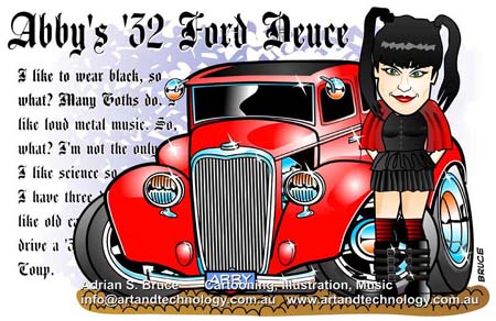
You might think our PInterest stuff might be worthwhile. Haven't seen that to be the case. Only our NCIS ABBY image gets re-pinned, and the demographic there doesn't really seem to correspond to what we do..... or again, we just aren't any good at social media.


So we continue to be very wary of wasting time ( and thus money) for any promotion on Social Media.

Pounding The Pavement
Most of my customers have been from overseas.  Countries other than Australia for the most part. So visiting isn't a practical thing to do to places that historically like what I do.

In our local area we have distributed a services post card with samples to various printing and sign making places and have had a truly terrible response, due to the very conservative work these places do 99.9999% of the time.

We have contacted car parts companies, magazines, car and kart racing papers and suggested cartoons and other material to the owners and editors.  But, it is very much a right time right place type of thing, so unless you are in their face when something comes up, you don't get the job.  It is also REALLY REALLY hard to get anyone to actually answer the phone and not just send it to voicemail!

And no freelancer can afford to spend their time doing that.  Have a broad enough range of work to cover should help, but I have yet to see that help...  I get asked to do rather specific things in my styles...


We come up for Concept Art too, but those search words are tricky

I have done a fair number of Car Show Posters and that type of material. Each one is kind of an Advertisement for your own work as much as it is for the Show.  Has it helped?  Maybe is all I can say.

Traditional Advertising
If your trying to get the attention of people that would love to use your service, but aren't actively looking for you, then you end up considering traditional advertising.
That would mean Newspapers, Magazines, specialist Media  or things like paid Banner advertisements, Adwords or even pay Google to put you result at the top of search results for some keywords.  Buying a booth and sitting at a car show seems to work for some. We have looked into these things but have found the fees to be too high for us.

Marketing is a significant part of freelancing and what we do..... and we need more..... it is all a bit hit and miss. I'm sure we could do things better as far as the people that aren't actually looking for us are concerned.

Getting a Custom Logo Or Illustration Booklet
But when they do we make the process simple to understand, which helps.


We produced an Amazon eBook on our Cartoon work, and you could say that is kind of a marketing thing as much as it is a creative product.  To support that we also did a series of single panel Heavy Metal Garage cartoons,  such as this


and this


which we would have loved to go viral and get our name out there, but they don't get many views.
We are still adding some sometimes, recently a series of 7 water colors (and we may auction off the original artwork) but when something doesn't get noticed, it really kills the buzz to do more....

Have only just discovered that CAR-toons Magazine is coming back, and maybe that is something we should explore..

We have many samples of our work and can be contacted at our website Art & Technology.

We also have our eBook on Amazon!


Hot Rodder T-Shirts - Cartoon Weird


These are some of our Hot Rodder T-shirt design on Zazzle

These are from the History Of Hot Rodding series showing the development of wild customization.....  some of it is actual fact!  They have been done as unique Watercolors.

We mostly do commissioned design work for vector based sign-age, shirts, stickers and what have you .

Samples of that at  Car Caricatures, Logos, Cartoons and Business Graphics

Thursday, July 23, 2015

Solving Tough Problems

I spent the first 20 years as an employee producing some quite famous products in the music production industries.  15 years of that in Japan.

I've spent the last 15 years now mostly being on contracts of one form or another in all kinds of industries in Australia.  So doing technical contracts, management and freelance artwork and cartooning is the way I've had to play it.

The business world has changed dramatically in the last 20 years, where the American MBA has skewed  large companies priorities.  That "lowest cost" is the only concern, and "best value" is not even on the table for consideration is bizarre.  Have been involved with companies that didn't think the development and support of their core product was actually important, because the "sales" side is the only thing important/non-trivial to them..

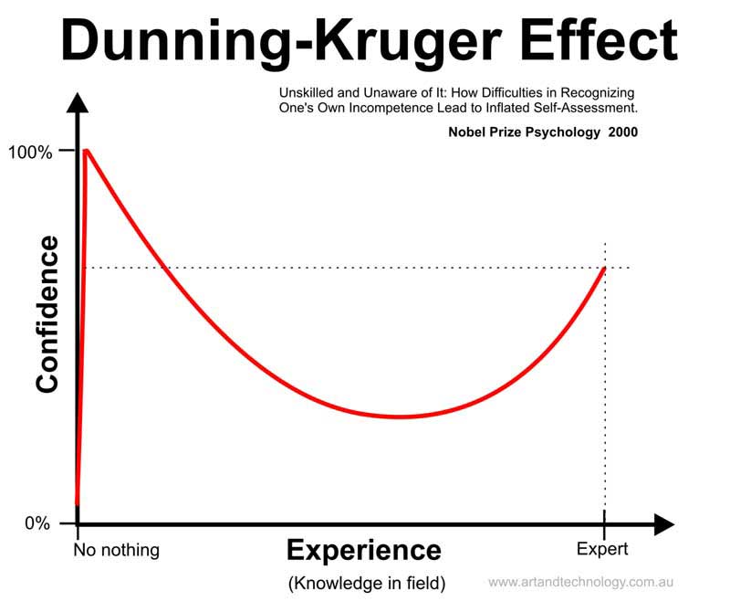
It is a part of human nature to over estimate your own ability in a subject you don't know anything about.


All summed up as the Dunning-Kruger Effect.  Even though this is now taught in Masters Of Business Administration (MBA) courses, it doesn't mean anyone actually learns from it.

When senior management is mostly from sales or accounting, other departments are under represented, and their importance belittled.

Things really could be done better..... There is something really wrong when senior management doesn't even comprehend a technical issue in their product...


Saturday, July 11, 2015

History Of Hot Rodding - Water Colour Artwork

Water Colour Viking History Of Hot Rodding - NORSE POWER
Dave deal in the early 1980s contributed a comic to Car-toons magazine on The History Of Hot Rodding, from the Roman till Modern times.  He rarely contributed comics, more usually doing cover artwork, and this particular comic was more illustrations with text, than an actual comic.

I really like the history idea and tried a few History of Cool Stuff Videos on our Youtube channel, and have come back to do a few one off water colour works on the idea now.  This is the first on the Vikings contributions to the art form.

Showing our version of a Cartoon Viking Dragon boat, with the addition of a Supercharged Hemi V8 instead of sails. A main point of the work is the wonderful water that can be achieved with water colours.

How the West was Opened Up and revved to 4000 RPM
And here is a Wells, Fargo & Company Stage Coach Opening up the West and revving it to 4000 RPM.

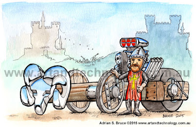
The Medieval Ramcharger
Or the Gentle art of the Siege.....

Ed Roth and the Beatnik Bandit

And don't forget Ed "BIG DADDY" Roth and his Beatnik Bandit. This guy  invented the show car custom and t-shirt car art! What isn't there to love?!

We usually do commercial Digital/Vector Illustrations for sign-age, websites and business use but one off illustrations in traditional media have their uses too.

Our Water Colour Toolset

These are done with a small Cotman water colour set, that has had the "China White" , replaced with an "Ivory Black", on textured water colour paper and water proof  Faber-Castell PITT artist pens.

And customizable shirt variations of these and others are now available at out online store

T-Shirts at Zazzle


We can be contacted at Art & Technology


Wednesday, July 8, 2015

Freelance Patent Illustrations and Industrial Artwork


We have had a lot to do with patents over the years. Much of it tedious when we had to avoid what others had already patented. But doing Patent Illustrations for others is not like that at all.

There is a certain style to Patent Illustration work, the way the arrows and numbers are. The way things are indicated. The sample above was one of 25 or so done for one application.  The main thing is to make clear and simple black and white line based illustrations. Even if many patents do not have the aim of being simple and clear!

These are done in a vector format and usually end up in a MS Word document for submission. Being able to follow the patent itself helps a lot here.

We have also done the design work for safety labels and other such industrial sign-age. Usually tough and waterproof die cut polycarbonate.

We can be contact at Art & Technology.


Tuesday, June 30, 2015

A Wedding Caricature on Framed Canvas Print

Wedding Caricature on Framed Printed Canvas 16" x 24"
This is a recent caricature that is being provided on a framed canvas print 16" x 24". The original design is based on photographs from the wedding, drawn on paper, scanned and then painted in Photoshop at 400dpi.

The actual caricature was done over a week.  It has an extended background. The resulting high resolution jpeg was then uploaded at The Canvas Factory, were the image was placed, and the option selected where background wraps around the sides to produce a unit that doesn't need any other frame.

The production is all done at Mostly Pty Ltd, Floor 2. No 16 Jianmeidong 2 Road, Haicang District, Xiamen China and the same supplier would be available from many other sites as well.

The canvas is supplied nicely protected for shipping from China. The frame and print has been done with a UV coating to prevent fading in Sun light.

The image file was uploaded on a Monday, and delivered the following Monday for a reasonable price.

Larger and smaller canvases are available and is the printing option we suggest most often for a wall hanging of our commissioned work.

Our contact details and other samples of our caricature work can be found here: Pop Culture Caricatures and Cartoons


Tuesday, June 23, 2015

Google's Random, Continuous Change and our Small Business

YouTube Channel View Decline over last 12 months 
This post is a few random comments related to website SEO, and encouragement, or the opposite, for YouTube video creators.

The current software development "fashion" is Agile sprints and continuous releases.  That in itself is fair enough, but having to continuously update apps or code, with no visible or measurable merit is tiresome and a waste of time and bandwidth.  Due to the time constraint on a development Sprint, it seems that many take the easiest, less risky route, by not doing something actually important. Just random small changes. With all the same staff activity, poor management cannot tell the difference!

We can imagine that a lot of  app updates are purely to support some new device, or some corner case bug fix. It is all rather too much like programmer busy work. And if there is no merit in the update to me, I don't want to waste time precise and energy on it!  

What gets tough for a typical small business based around a website are never ending random changes by Google to their SEO algorithms. We aren't doing any of the website "dirty tricks" and so do not expect to get "punished" as seems to happen.  Even if it doesn't appear that we are less easy to find in a Google search in our testing, we can have significantly changed site views, and thus job quote requests.
For our artwork, we are always at the whim of Google coders giving priority to skimmer sites stealing our Image content and hosting it on their click bait sites. Change the name of an Image file, and it is now "new" on a different site, with thousands of other stolen Images and the site becomes the master depository of design on the internet!  We think part of the problem is that Google Image search has always been very broken.  We have watermarks on our images, but if a prospective customer cannot directly get to us, and has to type in the url, they are just as likely to go elsewhere.

For other work, it is just a jungle out there, where hype usually wins.... not us.

One of the things we also have are videos of sample work and the "making of stages" on YouTube with our original soundtracks. All the videos have a link back to our main site. Nothing strange about any of that. Now the above graph shows the steady decline of views over the last year for our channel with its current 32 videos.  We have to ask "why" the steady constant decline?  A change to the YouTube search or referral algorithm?  Tastes have changed in 12 months?  The content is "so last week"?   The algorithm is biased towards this weeks new and shiny thing?

They have all been done in SD video resolution and YouTube now promotes HD. Has that been the reason these appear to be demoted? Or is it something else? Are there now "better" videos doing the same thing on other channels? It seems to indicate is that spending effort on YouTube is now not worthwhile for what we do.   Without any guidance we don't know what to do differently.

Now it isn't just me that has noticed view declines.... with the most likely reasons being that Google has changed the definition of what a view actually is, to probably include retention, in an attempt to get rid of bots and bought clicks gaming their paid advertisement system.

YouTube Channel views per platform
That is all likely, but this view per platform shows the mobiles have dropped off a lot, and they are 54% of all views! Or rather things claiming to be mobile views have dropped off.  Could be related to the "Facebook Fraud" bought likes issue.  THE AD CONTRARIAN   goes into much of how dodgy Social Media and Web advertising is, and this could just be an attempt by Google to improve the quality of their system.

Also note our videos work just fine on SmartPhones, so this decline for SmartPhones is "interesting". We could guess the countries involved in being paid for clicks have been using Mobile Phones...      but we are just guessing and don't have the facts.

Anyway, we have been told the videos are helpful and should leave them at that.   Videos aren't like a website where they can be updated.  Notice that the dates I added my last two videos didn't change this downward trend of views at all, so if this was a way for Google to encourage authors to make more new videos, it has done the opposite.....

Random, Continuous Change is NOT the same as Continuous Improvement. Ask Microsoft and Nokia why they fell from grace.  Some companies don't seem to know the difference.  KPIs  are not as trivial to set as most MBAs think.....

Not all change is good and worthwhile, other than keeping a bunch of smart programmers from solving the worlds ACTUAL REAL PROBLEMS, like Gene Therapy, Cancer, Alzheimers or world pain and suffering.

Keeping up with, and working out how to cope with, the changing web is an ongoing, unwanted challenge!

We can be contacted at Art & Technology


Wednesday, June 17, 2015

Xtreme 4x4 Custom Cartoon Toyota Sketch to Final Digital Comic Rendering


Here we have some of the stages from rough scribbled sketch to final rendered cartoon of an Xtreme Toyota 4x4.  Ian Johnson would approve.  Three A4 sheets photographed with a phone on a table.

It isn't so exaggerated and extremely caricatured.  The final image is for printing on A3 paper at 300dpi. That is an image at 4961 x 3508 pixels.

My first scribbled sketch made it look more like a monster truck, but we toned that down.  The middle image here is the way I now do the more refined sketch in non-photo blue pencil and ink directly over it in Artline and Copic markers and brush.  Just love those brush pens.

I have a light table and start the refined blue pencil sketch  on another sheet of paper over an enlarged agreed to rough sketch.  In this case my original monster truck styled thing was edited in Photoshop to form the starting rough scribble at top  here....  printing it out also enlarges it to the size we need.

Not having to erase the pencil keeps the ink lines sharper, and it saves all that time and some damage to the paper. Scanning in RGB then selecting the Blue channel drops out the blue pencil leaving just the black lines.

That is then colored in Photoshop, using a Wacom tablet.  I call this the Digital Comic Approach.

This was a commission for a gift....

But is it finished yet? Maybe not. Without out some time between doing it and being able to review it, I don't notice mistakes that need fixing. And doing it in  Photoshop makes that easier and invisible. Like is that front right tire just a little too tall?

We can be contacted at Art & Technology


Friday, May 29, 2015

The Shared Nightmare

I graduated from university some 34 years ago. There was one thing about it I had forgotten until a few years ago.

I was at a consultancy a few years ago, that unfortunately, went out of business due to a lack of work after we delivered the last of our large multi year projects. There was a great mix of people there, young recent graduates, experienced veterans and an older PhD, and we all sat around a big table and chatted over our lunch break.

At one lunch chat, having nightmares about not being able to graduate because you some how forget to attend some course came up. The older PhD said.... yeah... I  had those for decades after graduation.   Yes, I had those too!

And what I found strange and memorable about it was I probably had only stopped having them in the not so recent past.  Probably 25+ years of decreasing severity, but no one or group I had ever been with before had ever mentioned nightmares.   That may be because the brilliant group of us at the consultancy all had some other common characteristic that meant we had not spent our careers sitting in large slow moving businesses, and had temperaments  that didn't find that attractive.

...... we cared a lot about what we did, and that could give you nightmares.   I don't expect your typical , or garden variety,  CEO gets nightmares.


Tuesday, May 12, 2015

Googles Mobile Friendly Webpages - Take 2!

Original- mobile desktop- mobile phone

We have spent much of today going through the Google Sample Code  and producing a "to Googles requirements" version of an important page on our website - Car Caricatures, Logos, Cartoons and Business Graphics. To replace the existing index.html "desktop only formatted" page.

Very much based it on their code and structure. It uses CSS @media  to use different formatting when the screen is greater than and less than 600px wide. I have used their sample table construct to form my horizontal changing to vertical menus in a similar way I did mobile support in my previous version.

Their finished code has bugs in it too. Maybe that is part of their course the student is supposed to fix, but they have things like missing closing HTML, HEADER BODY tags and other things.
In my previous mobile friendly version,  I effectively added an additional website formatted for 320px wide screens and used php to generate or select the correct format for the client device.   All worked fine for users, except Google Webmaster Tools complained the desktop format files were not mobile compatible, Duh! , even though the mobile formatted were.

Now I thought that was mostly fine, and as far as I could see in my testing in Google of our keywords we were still ranking OK, even if there were way more skimmer sites now showing up with our images in a Google Image search rather than our source images on our site.

So we watched and waited and have seen our site accesses drop 50% or so over the last two months.  Have been thinking about and testing theories as to why.

So is not being Mobile friendly the Google way the problem?  Don't think so BUT...

To find out, we have again updated what was our desktop html file to be multi- screen. The right two versions in the above image.

The fonts all round are all a bit big to me, but that is what Google is recommending, so we will stick with them at the moment.

I've also taken the chance to break up the gallery images to now be on 5 different pages instead of one long one, or the 3 above.  So faster to load.


Awesome, so Google says,  but their fonts are so big that the first screen is JUST the title and menus! I think this is dumb, but I don't have the influence of Google.

We will sit, test and wait again to see if this changes the page access results.  It is a lot of work to redo all the pages, again if it is.

I suspect that it is related as much to other referencing sites not being mobile friendly, and their rank has dropped, and that Google has changed their ranking code, and broken it.  I suspect this as these BLOGGER pages also have their images drop out of image search, and this has always been Mobile friendly, and they did come up before Google changed things.

I suspect Google broken code is because the programmers are listening to non  instrumental music!

Now if you actually come to this Car Caricatures, Logos, Cartoons and Business Graphics page via the main page, you will get our current Mobile page. You have to select the "non-mobile" option near the top of the page to get to the new "Desktop-but-also-Mobile-compatible-page" 

We can be contacted at Art & Technology


Wednesday, May 6, 2015

Topgear, Clarkson and the Essays. How Hard Can It Be?


Topgear being funny was due in not some small measure to Clarkson's outrageous writing.  Like:
"Owning a TVR in the past was like owning a bear. I mean it was great, until it pulled your head off, which it would."
And that it was all a boys adventure where they didn't take it all seriously, but it had tremendous production values. All those stop frame/ slow mo/ fast mo moving clouds reflected in puddles near car wheel stuff.

And what was a surprise to me,  three times now, was the books Clarkson has out,  have little funny in them.  Silly, but not funny.  

They are collected essays from his newspaper columns,  and  many read to me like "OMG, I have to have an article for Sunday, what will I write?!" and he decided to make fun of some nearby county or something that doesn't mean anything to someone on the other side of the world.  This could be due to time and lack of editorial input for a column, but I don't really know.

And the same is true of the Top Gear Magazine.  Bought a few issues over the years, and found the same thing. The columns from the guys aren't special. The articles don't have any of that Top gear magic to them. 
One issue I did get included a collected pink booklet of Clarkson, Hammond and May Topgear columns called Little Book of TOPGEAR GENIUS that, franky, isn't.  

A pity.  How hard can it really be? Sometimes, very hard to be ACTUALLY funny.


We can be contacted at Art & Technology.


Thursday, April 23, 2015

Custom Merchandise Design - Playing Cards, Stickers, Badges and Shirts


We have done a lot of commissioned shirt, sign and sticker designs. But this picture shows something different again.

Custom Playing Cards. These are from our Heavy Metal Garage Drinking Game...

We can be contacted at Art & Technology