They wanted that removed, so the final design doesn't have it. The design also had the visual shake effect lines, and they were happy enough with that.
I just wonder why.
It just confuses the design?
Maybe they should have just been in white outline text and not so visible?
Maybe.
To me the Sound Effects go hand in hand with Visual effects, like the above double spread from Five Star Stories Volume 1. Those big machines and the storm are making lots of noise, and the sound effects are very big in the panel.
Blambot.com has fonts specifically for sound effects and comics really do need them. I have a few of them, and hand draw them without using a font too.
So I will try and use comic conventions when I think they are appropriate, but don't have any problem removing them if the client doesn't what them in the illustrations I do. I probably wouldn't have been so obliging 20 years ago, but I have changed. Matured even.
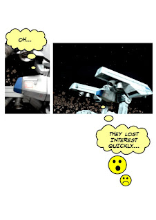
I have started to use emoji's in some designs too. If it seems appropriate. Such as this panel from a comic I put on webtoons.
It really works for me and is universally understood. That can be an advantage depending on what your trying to express.
We are now in Kyoto Japan, but our website and email is as at has been for the last 10 years, Australian based, and will probably stay that way.
We can be contacted at Art & Technology.


No comments:
Post a Comment