Sunday, March 22, 2015

Megacurve - The Heavy Metal Garage Album Limited Edition Shot Glass with USB Flash Drive


Collect the Shot Glass, Get an Album! 

Have seen other musician's try different marketing strategies for non traditional albums. Like Joe Satriani's high resolution audio file USB drive based album collection in a chromed dome head and Ali Spagnola with her Power Hour drinking album.

So we present our own numbered limited edition collectible HEAVY METAL GARAGE Shot Glass with reusable 8GB flash drive with our album.  Heavy Rock and a few pop synth tracks and 2 with vocals as MP3 files.  Also includes the original MP4 videos in way better quality than you find on our YouTube Channel.

We have put together The Collector Editions  page for this and another item.

Contact us for how we can help you.


Saturday, March 21, 2015

Car, SciFi, Concept Illustration, Promotion and the InterWeb

This post is a bit of a ramble about being a freelancer and some experiments in promotion on the Internet  and otherwise, for the type of things we do.

I've had a website since 1995. I've been on Twitter since 2011, some 4 years, and on Facebook for about the same.  Have a personnel Facebook page and an Art & Technology Facebook page. Also YouTube and SoundCloud Channels.

We stopped bothering to update the Art & Technology Facebook page some time ago. We only had some 50+ likes to the page, but even then Zuckerberg and Co. only showed a post to 2 people who had liked the page, and so signed up to receive updates.  Then offered to show it to more for money. That is just a joke with the other options available, such as our own website.

Even this Blog gets way more than that, and the posts end up on G+ too, and the "impressions" below shows Twitter gets way more as well. Twitter doesn't limit your audience and has nothing like the "Edgerank" that Facebook invented to screw users with.  Sub conclusion: FACEBOOK IS A WASTE OF TIME. 

Some of our Tweet Analytics
The real interesting thing about the above stats from Twitter is that the use of the correct hastags is real important to get any audience if your not a celebrity with millions of non discriminate, unsophisticated followers.

I'm no celebrity. If your reading this you must have class or at least expect to learn something.

The other thing is the interest in the SciFi Concept Designs shown on twitter doesn't equate to much real world work opportunities.  Did some in the past, but haven't had any opportunities in that area for a decade or so.  It is the car / truck/ bike related stuff that people want and will commission me for.

Does that just mean I haven't promoted that type of work to the right people? Short answer, Maybe. I think the game, TV or film gigs are actively gone after by the hordes of hopefuls (and probably their agents) out there, and the people needing the design work aren't hitting Google to find people such as myself. They just don't need too. They have people knocking on their doors to do it.  A lot of work is probably like that. If your banging on their door when they need something and your adequate, you will get the gig.

I should mention the designs I posted to Twitter have been on my website for years and don't get much attention there from Internet traffic now. Twitter interest may have resulted in a short spike of interest, but nothing significant.  So the people on Twitter are not Googling such work either, or they would have already known about those illustrations, right?

It seems that people promote themselves on Twitter and Facebook, by following or liking  LOTs of people in the hope they will be followed in return.  But you all knew that didn't you? Same is true at SoundCloud, where other musicians aren't the ones who would buy your music, and not the people you actually need to target.

I have had work from sign makers that aren't local to me.  The wonder of the Internet!  I tried visiting local sign makers and left sample/contact cards and you would have thought that I had 3 heads from the reaction the places gave me.  Not all sign makers have an imagination..

Also get work from Graphic Designers. This is because most Graphic Designers cannot actually draw and do an illustration, and that is part of a job I can help with.

Other work just comes from all over the world by people that have found Art & Technology.  Via this Blog or our YouTube channel.

All just more clues and riddles in the life of a  freelancer.

Conclusion: Your website is still the most important, followed by knocking on doors if you actually know some place that might need your work . Publishing on paper helps too, and I have in the past had material published in a few different magazines. Gives extra validity to what you do.

I haven't seen Social Media as being significant at all. It is more like soon forgotten light entertainment and for fans of celebrities. The Oatmeal has great success with it, but I see him as more of a celebrity than an artist. I mean really, it seems to get to a stage where people are famous for being famous, and it doesn't matter what they produce, and The Kardashians are just one example of that.

And the real kicker is The Ad Contrarian,  with loads of info on just how useless Social Media Marketing is.

Your mileage may vary.


Wednesday, March 4, 2015

Podcasting with Reaper


This is our current Reaper set up for recording our Podcast.

  1. A temp track to record vocals to.
  2. The final track good edited takes are moved to. Has a 70Hz HP filter on it.
  3. Effects track. A synth swoosh we are using for transitions.
  4. Music track. We we have brought in 3 of our tracks and selected just short sections.
  5. Reverb. ValhallaDSP's Vintage Verb to apply to the voice and effects.
  6. And we put Ozone 5 as a master effect to compress and limit the result, to make it loud and consistent. Not the way we work for music production.
The resulting rendered 16bit .wav was then converted with LAME to 64kps MONO. Not so great for music, but good for voice and producing a small file size.

I am doing very little editing, other than removing too long pauses and interruptions. Aren't fixing miss pronounced words, as it just makes it a much longer process to do that, and I want to keep it quick, and like a friendly chat.

And we have decided to put the Podcast archive on SoundCloud, instead of our server, and allowed them to be downloaded:

https://soundcloud.com/megacurve/sets/podcasts

We can be contacted at Art and Technology. Which is also where the podcasts are.


Tuesday, March 3, 2015

Mobile Friendly Sites now Google Mandated


Got the Google email today that 80% of my site isn’t mobile friendly, and that soon, that would impact the site rating. I’ve had a Google Webmaster account for years and so they know how to contact me.

And Yes.  I know that the site isn’t 100% mobile friendly.

About 3 years ago I looked into Mobile friendly when  I got a Smart phone and saw how tedious the site was. I  made the pages I get my business from all mobile friendly back then.
But that was just the Front Index, Cartoons and Business Logos, About and Contact pages.


The approach I took was to keep the existing pages the way they were, then added m.mobilepage.html versions for the mobile formatting.

I took this approach as the site is written in raw html and recently with a bit of php.  It is the way I started developing it back in 1995.  It also makes it robust as it doesn’t have any malice code injection points the CMSs do, but that really wasn't a consideration at first.

I researched and tried the different approaches to being mobile compatible.  What I eliminated immediately was the client side JavaScript approach. That is just so slow, and I hate the way the screen rewrites itself.  
I decided that the server knowing what the client was, then sending a mobile or desktop page was the best approach. Means php code has to run first and make the decision, but that makes testing difficult, as I only have access to a few client devices to test on.
The server side approach  is fast for the viewer, and the fonts and menus can be made readable and usable simply.  I take the approach of practicality over style and always use text as links for menus in a consistent fashion.

So on a desktop page, there will be a few link options across the page. In the mobile, these will be one per line with a

separator between them, which doesn't cause any problem of actually selecting the menu item with your finger on a small screen mobile.

The way I've done it means I have to update both pages with new content, even though the html of the update is the same in both.  I may have to look at this on the revision. Probably using php to merge the desktop or mobile header file with the actual single content html file

But years ago I found that when I used small 59 pixel wide preview images linked to larger images, the larger images didn't show up in Google Images.  I had to only use the larger images, but display them in the thumbnail size.  Makes a page heavier to download than it should be, even though it looks the same.   Just some Google indexing bug, but important to an image based page.

May be time to eliminate some now not so popular links too, and focus the site more.  Fine as long as I do it before April!


Sunday, March 1, 2015

Car Concept Art - Street Machines & Customs

This is a 1967 blown Ford XR in Bronze with low profile tires. Very unlike how you would do it in 1967. The car hasn't been built yet, and this will help the builder decide on the direction the will go in.

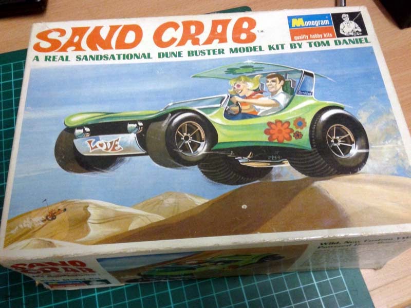
One of the things Chip Foose is known for is his concept art. The idea on paper before the shop begins work at Overhaulin'.  But way before him there was Hot Wheels, Ed Roth and Tom Daniel in the 60s and 70s. Roth and Daniel had model kits of their machines available to any young man lusting over fine automotive awesome coolness.  Here is something in that 1970s  1/24th Model Box style I did previously. Southern California Custom Cool.


I'm thinking of talking about these influential designers and a few other things in our next Podcast. I had Hot Wheels and the Tom Daniel Model Hot Rods and drew thousands of my own when I was younger. A major passion from maybe 1968 till 1974....

Original 1969 Tom Daniel Sand Crab Box with built up car
I thought I was going to be some type of car designer before I was told in no uncertain terms no one actually did that in Australia in the 1970s, and so took up electronics focused on audio instead as a more secure future.  (Funny how there isn't any Audio electronics design here in 2015, but people do make custom cars!)

We have a lot of concept art stuff, but it is mostly of real industrial boxes and products we have been involved with. Most of the Concept Art on our website is Sci-Fi styled things. Design sketches in cool grey dry markers mostly.  Hopefully this car artwork will adjust the balance.

The line work in this was done in Corel Draw and the rendering was done in Photoshop. It is 300dpi A3 size.  It is based on reference photos of the base car, available rims and an engine style I had been sent.

It is in Car Concept Art style.

We can can be contacted at Art & Technology.